- Introduction
- Why Fonts Matter in Trade Show Environments
- The Science of Readability and Visual Flow
- Choosing the Right Font Weight and Size
- Aligning Fonts with Your Brand Identity
- Contrast and Color Considerations
- How Signage Supports Overall Booth Strategy
- Fonts That Stand the Test of Time
- Partnering for Better Visual Impact
- Design Smarter with the Right Typography
Introduction
Trade shows are all about making a powerful impression in a short amount of time. When potential customers walk by your booth, you have only seconds to grab their attention and draw them in. One of the most underrated but essential elements of effective trade show marketing is typography. The right font can enhance visibility, reinforce brand identity, and communicate professionalism. The wrong font can make your signage hard to read or seem unpolished. Understanding the best fonts for signs and how typography influences viewer perception is a key factor in trade show success.
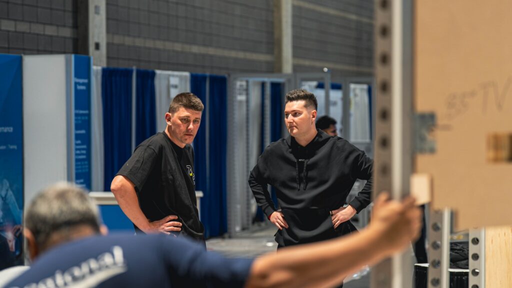
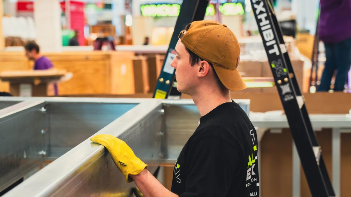
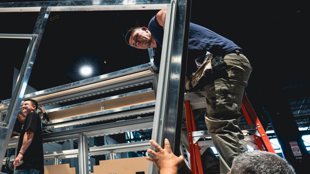
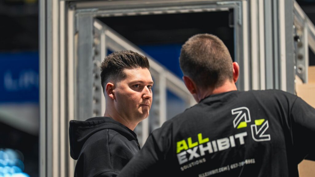
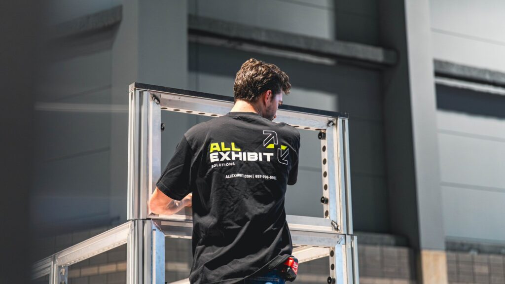
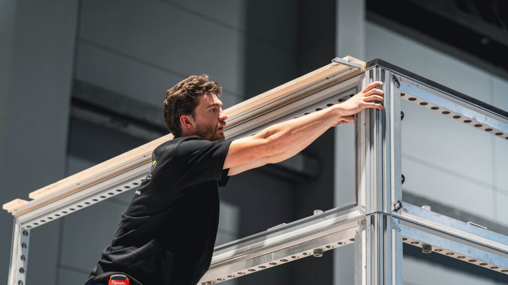
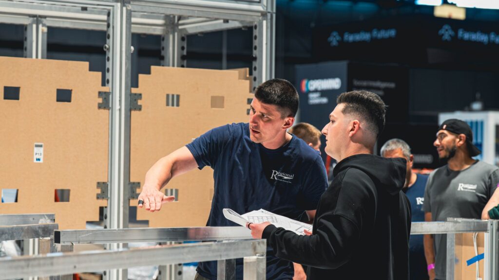
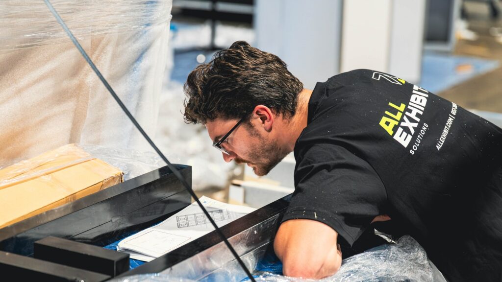
At All Exhibit Solutions, we specialize in trade show booth installation and dismantlement, giving us a front-row seat to what works and what doesn’t. We’ve seen firsthand how clean, legible, and well-designed signage can boost engagement and traffic at a booth. In this blog, we’ll explore how to choose the most effective visual fonts for trade show signs, banners, and posters, focusing on style, clarity, and impact.
Why Fonts Matter in Trade Show Environments
Fonts are more than just a design detail. They are a visual representation of your brand’s tone and personality. At a trade show, where hundreds of companies are competing for attention, typography plays a crucial role in visibility and communication. Clear signage allows attendees to immediately identify who you are and what you do. Fonts that are too stylized, overly decorative, or too thin can hinder legibility, especially from a distance.
Clarity should be a top priority. When attendees are walking quickly through aisles or scanning booths from across the room, your signage needs to be readable at a glance. Fonts that are clean and bold perform better under these conditions, especially when paired with high-contrast color combinations. Choosing the best fonts for signs isn’t just a matter of taste—it’s about function and performance in a high-traffic environment.
The Science of Readability and Visual Flow
Effective signage directs the eye and guides people toward action. Font choice influences the natural reading flow, with certain typefaces making information easier to digest. Sans-serif fonts are often recommended for signage because of their simplicity and modern look. These fonts lack the small decorative strokes at the ends of letters, making them cleaner and more legible, especially at larger sizes.
Fonts also affect how quickly information is absorbed. Bold fonts with wider letter spacing tend to be easier for the eye to track, especially when used in headers or calls to action. The use of consistent, clear typography across all signage helps maintain visual coherence, which is vital for creating a memorable brand presence. When everything is aligned visually, it becomes easier for booth visitors to understand your message.
Choosing the Right Font Weight and Size
Signage is meant to be seen, not studied. Font size and weight make a big difference in how text is perceived. Larger font sizes are essential for headers or booth titles that need to be read from a distance. Smaller fonts can be used for subheadings or supporting text, but they should still be easy to read up close.
Font weight refers to the thickness of the character strokes. Bold fonts make strong statements and work well for main titles or emphasis. Light or thin fonts may have a sophisticated appeal, but they can become difficult to read when printed on large banners or posters. A medium to bold weight often strikes the best balance between aesthetic and readability.
When installing signage, it’s also important to consider how lighting, angles, and other elements of your booth might affect legibility. Glare, shadow, or overlapping displays can interfere with font clarity, so planning for real-world conditions is essential. All Exhibit Solutions ensures that booth signage is not only properly installed but also optimally placed for maximum visibility.
Aligning Fonts with Your Brand Identity
Fonts are a visual extension of your brand. The best fonts for signs should align with your overall brand identity, including your logo, website, and printed materials. A modern tech company may opt for a clean, futuristic typeface, while an artisanal food brand might prefer something warmer and more handcrafted. The key is to maintain consistency and authenticity.
Using too many different fonts in one booth design can confuse the viewer and dilute the brand message. It’s generally best to stick to one or two complimentary typefaces—one for headers and one for body text. This creates a unified look and helps establish a clear visual hierarchy. Typography that feels cohesive gives your brand a polished, professional appearance.
When installing and dismantling booths, we often notice that companies with strong branding stand out the most. Their signage isn’t just readable—it feels like an extension of their company culture and values. That kind of intentional design goes a long way in creating memorable experiences on the trade show floor.
Contrast and Color Considerations
Even the best fonts for signs can lose their effectiveness without proper contrast. Text must stand out against its background, especially in busy or crowded environments. Black text on a white background is the most readable combination, but other high-contrast pairings, such as white text on navy or yellow text on black, can also work well when used thoughtfully.
Avoid placing text over busy images or backgrounds with low contrast, as this significantly reduces readability. When printing large-format banners or signs, it’s important to test how colors and fonts look under actual lighting conditions. What appears legible on a screen may look completely different in a real-world setting.
All Exhibit Solutions works closely with clients to ensure signage is not only installed correctly but also positioned for optimal legibility. We understand how important it is for every element—color, font, layout—to work together in harmony.
How Signage Supports Overall Booth Strategy
Signage is more than just decoration—it’s a functional part of your booth’s communication strategy. Fonts play a vital role in establishing tone, delivering information, and guiding visitors through your space. Whether you’re highlighting a product feature or promoting a giveaway, the effectiveness of your message depends heavily on how it’s presented.
A well-designed sign with carefully chosen typography draws people in and invites engagement. It should feel effortless for attendees to understand your value proposition. Good signage can also enhance wayfinding within the booth, helping visitors navigate stations, demos, or product areas with ease.
When we handle booth setup and dismantling, we often notice the difference that clear signage makes. Attendees are more likely to approach and interact with a booth that communicates its message clearly. It creates a better overall experience, which leads to stronger leads and more meaningful conversations.
Fonts That Stand the Test of Time
Some fonts consistently perform well across industries and exhibit types. Typefaces like Helvetica, Futura, and Gotham are known for their clarity and professional appearance. These fonts are versatile and adaptable to a variety of design needs, making them reliable choices for trade show graphics.
Custom fonts can also work well, but they must be used with caution. Highly stylized or overly decorative fonts can be difficult to read, especially at larger sizes. If you opt for a custom or unique typeface, ensure that it’s used sparingly and supported by more legible fonts for informational text.
The goal is always the same: make it easy for attendees to understand your message, recognize your brand, and remember your booth. The right font contributes to that goal by enhancing the visual appeal and functional clarity of your display.
Partnering for Better Visual Impact
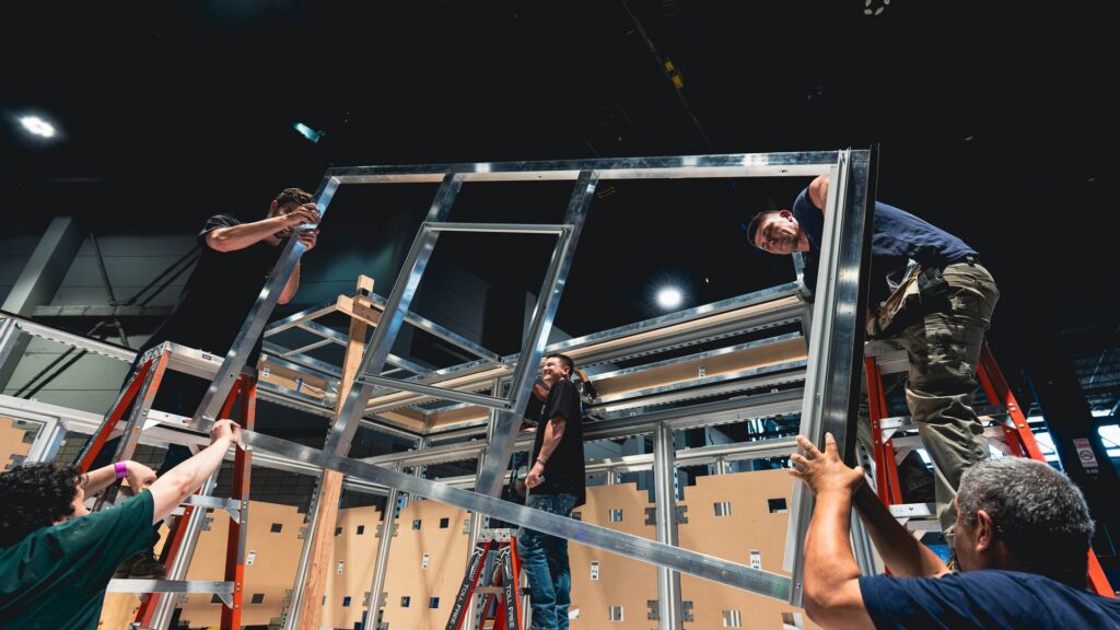
At All Exhibit Solutions, we bring years of experience in trade show booth installation and dismantle. While our expertise lies in the physical setup, we also know that visual presentation—including typography—can make or break your trade show presence. That’s why we collaborate with designers and clients to ensure that signage looks great and functions as intended.
We’ve worked with brands in every industry, and we know what fonts and signage layouts work best in high-traffic, high-stakes environments. Our installation team pays close attention to positioning, spacing, and lighting to ensure that every sign is easy to read and positioned for maximum impact.
Whether you’re planning a small booth or a large-scale installation, we’re here to support your vision. We handle the logistics so you can focus on what really matters—connecting with your audience and making a lasting impression.
Design Smarter with the Right Typography
Fonts might seem like a small detail, but they have a huge influence on the overall success of your trade show booth. Choosing the best fonts for signs requires a balance of form and function, aesthetics and legibility. The right typeface communicates clarity, reinforces your brand, and helps your booth stand out in a crowded space.
If you’re preparing for your next trade show and want your signage to work as hard as you do, All Exhibit Solutions is here to help. From expert installation to strategic guidance, we make sure every element of your booth is built for performance. Reach out today and let’s make your next show a standout success.
Recommended Articles
Top Pop-Up Display Ideas for Your Exhibition Booth
Audience matters as much as venue size. A pop-up aimed at engineers and technical buyers can lean into detailed product imagery and a demo screen, while one built for a consumer-facing event might...

Brendan Cogbill
How to Choose a Trade Show Booth Company You Can Trust
However impressive a design looks in a rendering, it only matters if it goes up correctly, on time, and looking exactly as promised. Installation and dismantle is where every other decision is...
Brendan Cogbill
Inline vs. Island Booths: What Is an Inline Booth and Which Is Right for You?
The configuration you choose ripples straight through your budget and your build. Beyond the space rental itself, islands and peninsulas usually require more material, more complex structures, and...
Brendan Cogbill
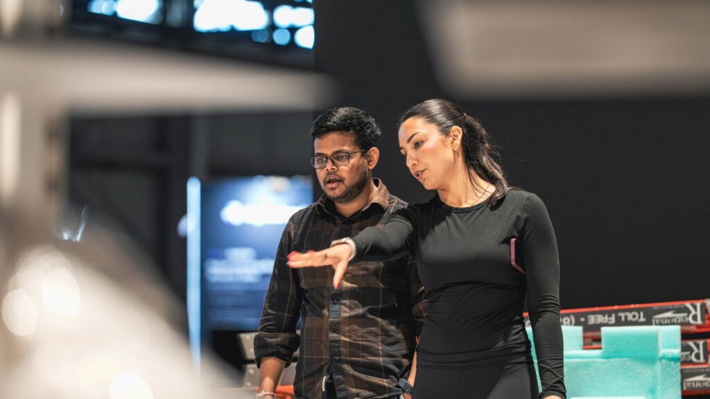
Exhibit Management 101: Running Your Trade Show Program Like a Pro
A single trade show is a project. A year of trade shows is a program, and the difference between the two is exhibit management. When a company exhibits a few times a year, the work tends to be...
Brendan Cogbill
What Is Suitcasing at Trade Shows, and How Do You Stop It?
The deepest protection against suitcasing is not a rule; it is a presence so strong that drifting away from it feels like missing out. A well-designed, well-built, and well-staffed booth pulls...
Brendan Cogbill
What a Strong I&D Partner Actually Saves You
On paper, installation and dismantle looks like a line item, a cost to minimize on the way to the part of the budget that feels more important. In practice, the quality of your labor partner quietly...
Brendan Cogbill
How to Build a Realistic Install and Dismantle Schedule
Share the schedule before anyone travels, not when the crew is standing on the dock. A short briefing that walks the team through the sequence, the milestones, and each person’s role turns a...
Brendan Cogbill
Inside the Custom Trade Show Exhibit Design Process
A beautiful exhibit is only as good as its execution on site. The final stretch covers crating, freight, material handling, and the install itself, all timed against the show’s move-in...